Visualizations
1 Overview
This section explains the interactive maps created to visualize flight diversion patterns. Each visualization reveals different aspects of how diversions cluster geographically and temporally across the U.S. aviation system.
2 Visualization Types
2.1 Individual Cluster Maps (Cascade View)
Shows all diversions for a single destination airport during a specific cluster period.
What it displays: - Blue markers: Origin airports (where flights departed from) - Red stars: Diversion airports (where flights were redirected) - Gold diamonds: Primary destination airport - Curved colored lines: Flight paths, with each color representing a different airline
How to interpret: - Density of colored lines = volume of diversions during the event - Clustering of red stars = which airports absorbed most diversions - Geographic spread = how far diversions traveled - Airline colors = which carriers were most affected
2.2 System-Wide Maps (Context View)
Shows all diversions system-wide that occurred during a cluster period, revealing the broader impact.
What it displays: - All diversions across U.S. (not just to primary destination) - Same color scheme as cascade maps - Reveals secondary effects and system disruptions
How to interpret: - Compares primary cluster impact vs. system-wide impact - Shows whether disruption was localized or system-wide - Reveals which other airports absorbed overflow diversions
3 Cluster 1: San Diego (SAN) - December 18-21, 2024
3.1 Individual Cluster View: SAN Diversions Only
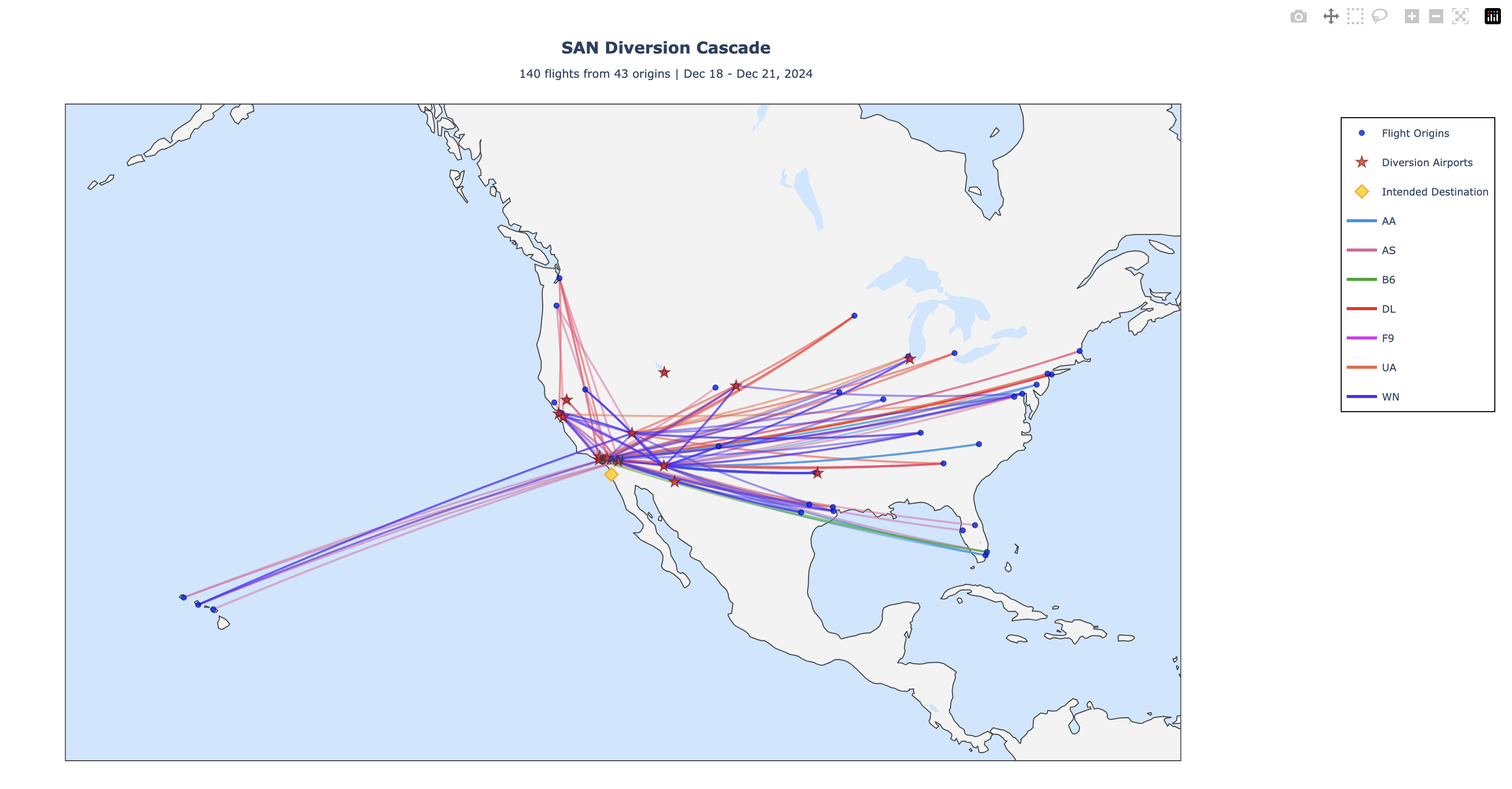
This map shows the 140 diversions specifically to San Diego International Airport during this 3-day period.
Key observations: - Most flights originated from California and Arizona - Phoenix Sky Harbor (PHX) was the primary diversion airport (33 diversions) - Ontario International (ONT) also absorbed significant volume (48 diversions) - Primarily West Coast airlines affected - Tight geographic clustering suggests regional weather event or airport capacity issue
What it tells us: When SAN experiences a disruption, nearby California airports (ONT, LAX) are the first alternatives used by airlines, followed by Arizona airports (PHX, PSP).
3.2 System-Wide View: All U.S. Diversions During SAN Cluster
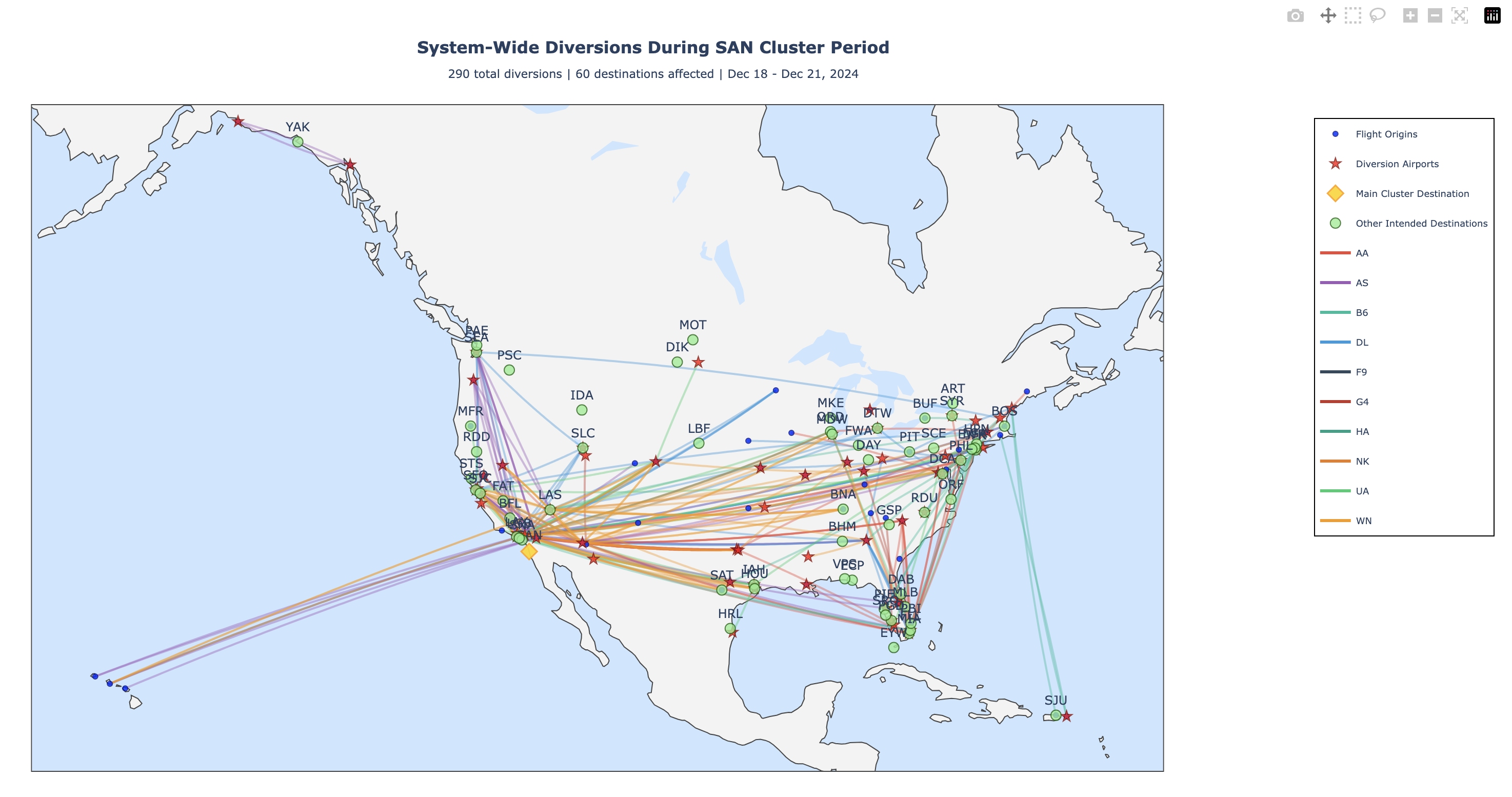
This map reveals the complete aviation system response during the same period - ALL diversions across the U.S., not just those to SAN.
Key observations: - 290 total diversions vs. 140 to SAN (48.3% to primary airport) - Other destinations affected: SNA (30), EYW (20), BOS (17), LAX (7) - 60 total destination airports affected (not just SAN) - 73 origin airports involved - Geographically widespread: West Coast, East Coast, and Southeast all impacted - Multiple airlines contributed to the cascade
What it tells us: The SAN disruption had system-wide ripple effects. When one major airport is affected, diversions cascade across the entire network, affecting other cities and regions. This is a true system-wide disruption event, not just a localized issue.
Interpretation: Only about half of flights heading to SAN were diverted there. The other half were diverted elsewhere, indicating either SAN’s capacity to absorb only part of the demand, or airlines making strategic decisions to distribute diversions across multiple airports.
4 Cluster 2: Dallas/Fort Worth (DFW) - November 4-5, 2024
4.1 Individual Cluster View: DFW Diversions Only
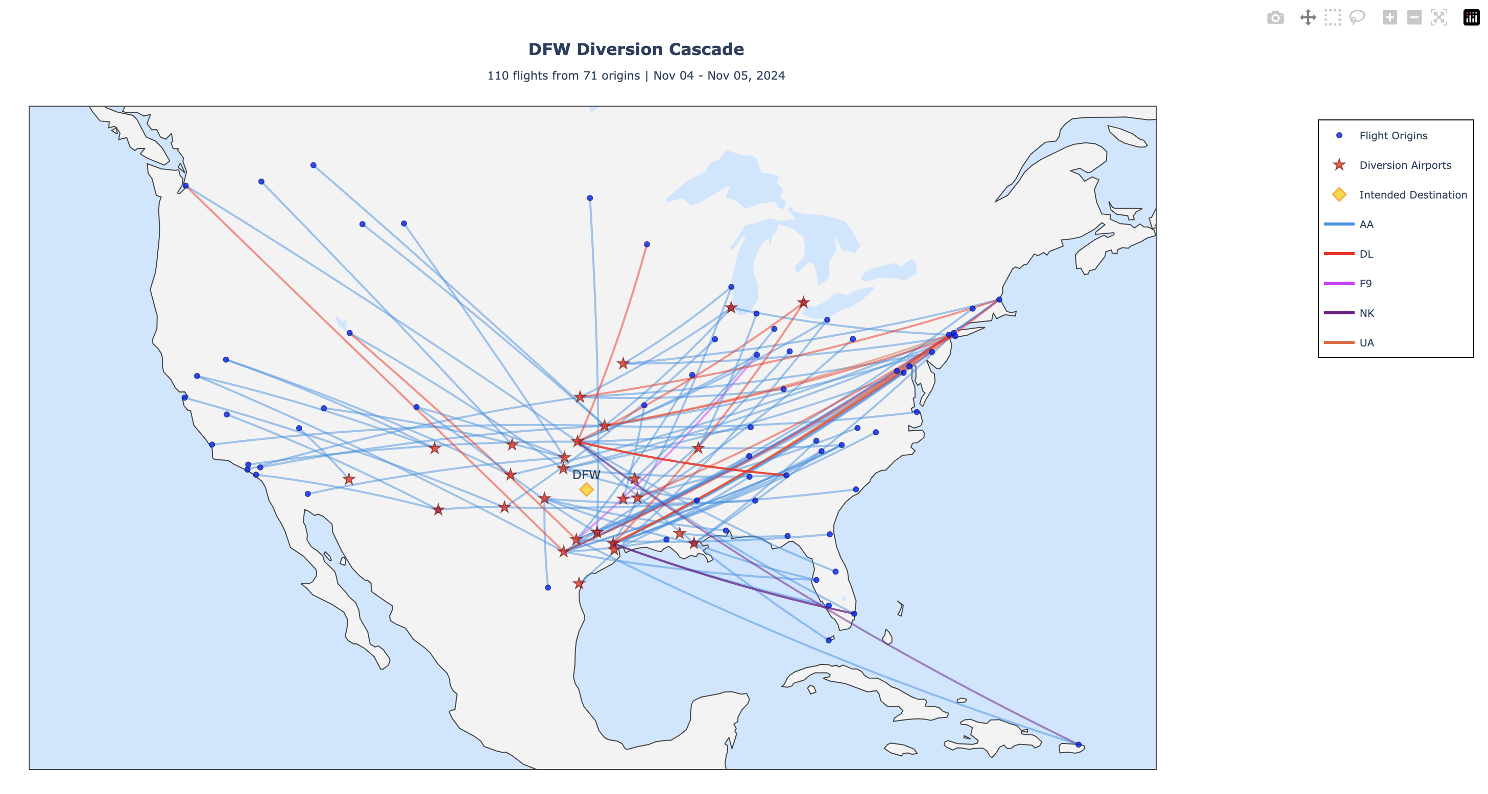
This map shows the 110 diversions specifically to Dallas/Fort Worth International Airport during this 2-day period.
Key observations: - Origins concentrated in Northeast, Southeast, and Midwest - Houston Intercontinental (IAH) was the primary diversion airport (28 diversions) - Regional pattern: Oklahoma City (OKC), San Antonio (SAT), Austin (AUS) also active - Primarily American and Southwest airlines (major DFW hubs) - Texas region tightly clustered
What it tells us: DFW diversions are concentrated within the Texas/South-Central region, with Houston emerging as the backup for Dallas flights.
4.2 System-Wide View: All U.S. Diversions During DFW Cluster
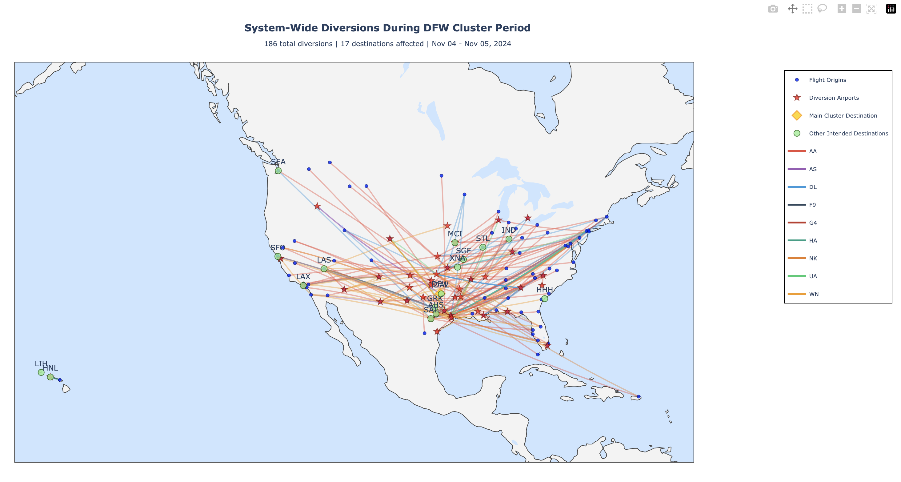
This map shows all diversions during the same period across the entire U.S.
Key observations: - 186 total diversions vs. 110 to DFW (59.1% to primary airport) - Secondary destinations: DAL (32), AUS (13), SAT (12) - 40 diversion airports used - 89 origin airports involved - More geographically concentrated than SAN event - Primarily South-Central U.S. (regional event)
What it tells us: This was a more regional event compared to SAN. The disruption impact stayed concentrated in Texas/South-Central region, with 59% of diversions going to the primary airport DFW. Other regional airports absorbed the remaining volume.
Interpretation: DFW disruptions have less system-wide impact than coastal airport disruptions. The regional nature of this event kept diversions contained within the Texas hub region.
5 Cluster 3: Chicago O’Hare (ORD) - August 24-26, 2021
5.1 Individual Cluster View: ORD Diversions Only
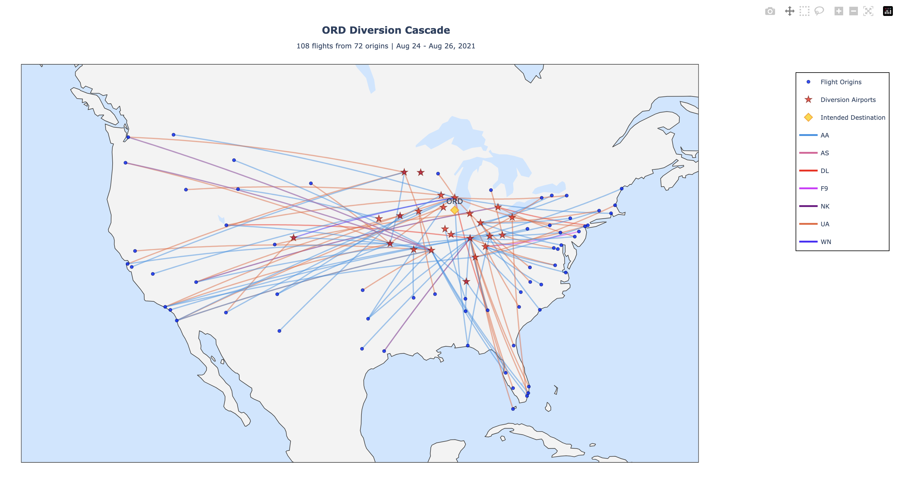
This map shows the 108 diversions specifically to Chicago O’Hare International Airport during this 3-day period.
Key observations: - Origins from across entire U.S.: Southwest, Midwest, Northeast, Southeast - Indianapolis (IND) was the primary diversion airport (24 diversions) - Secondary diversion airports: St. Louis (STL), Milwaukee (MKE) - Midwest corridor heavily utilized - United Airlines dominant (major ORD carrier)
What it tells us: When ORD is unavailable, the Midwest corridor airports (IND, STL, MKE) form a network of alternatives, with IND being the primary choice.
5.2 System-Wide View: All U.S. Diversions During ORD Cluster
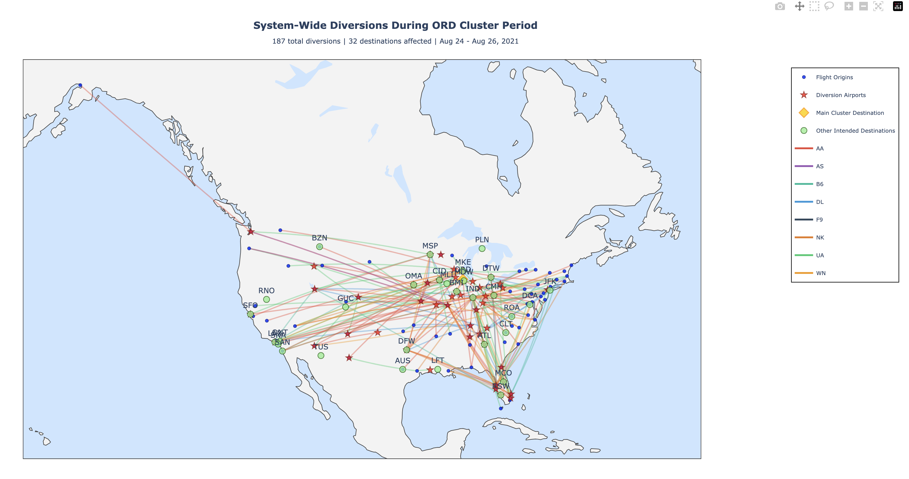
This map shows all diversions during the same period across the entire U.S.
Key observations: - 187 total diversions vs. 108 to ORD (57.8% to primary airport) - Secondary destinations: MCO (19), MDW (14), STL (9) - 51 diversion airports used - 87 origin airports involved - Similar to DFW in concentration (regional event) - Midwest and surrounding regions primarily affected
What it tells us: ORD disruptions have moderate system-wide impact - less than coastal airports but more geographically spread than DFW. The Midwest location means disruptions don’t cascade to both coasts, but do affect a broad Midwest-to-Southeast corridor.
Interpretation: Hub airport disruptions vary in system-wide impact based on geography. Central hubs like ORD and DFW have more contained impacts, while coastal hubs like SAN have broader ripple effects.
6 Key Insights from Visualizations
6.1 Pattern 1: Geographic Clustering of Diversions
Diversions concentrate in specific regional hubs rather than spreading randomly: - West Coast: ONT, PHX, LAX, SFO - South-Central: IAH, DFW, SAT, AUS - Midwest: IND, STL, MKE
6.2 Pattern 2: System-Wide vs. Regional Events
- SAN (coastal, major hub): 48.3% to primary airport, 60 destinations affected (system-wide)
- DFW (regional hub): 59.1% to primary airport, 17 destinations affected (regional)
- ORD (central hub): 57.8% to primary airport, 32 destinations affected (regional-to-moderate)
6.3 Pattern 3: Airline-Specific Patterns
Colors on maps reveal airline-specific routing: - Major airlines (AA, DL, UA, SW) dominate specific hubs - Each airline has preferred diversion airports - Enables prediction of diversion destinations based on carrier
6.4 Pattern 4: Cascading Effects
When primary destination unavailable: 1. Flights divert to nearest appropriate airport 2. Overflow spills to secondary airports 3. Eventually reaches tertiary alternatives if needed 4. Creates geographic ripple effect through network
7 How to Use These Visualizations
7.1 For Operational Planning
- Airlines: Identify which airports to pre-position aircraft at for disruption management
- Airports: Anticipate diversion volume during disruption events
- ATC: Prepare to route traffic to alternative airports
7.2 For Understanding System Resilience
- Notice which airports absorb diversions (IND, IAH, ONT, etc.)
- Identify bottlenecks where diversions cannot be easily accommodated
- Reveal geographic redundancy in the network
7.3 For Identifying Root Causes
- Temporal clustering (all within 12 hours) suggests single root cause
- Geographic concentration suggests capacity or weather issue
- Airline-specific patterns visible in colored lines
8 Limitations of Visualizations
- First diversion only: Maps don’t show secondary or tertiary diversions
- No causal data: Cannot determine weather, mechanical, or ATC reasons
- Aggregated view: Individual flight details hidden
- Historical only: Past patterns don’t guarantee future outcomes
- Mercator projection: Distorts distances, especially at high latitudes
9 Technical Details
9.1 Visualization Tools
- Framework: Plotly (interactive web maps)
- Data: BTS OTMC-OTP flight records
- Coordinate System: WGS84 (latitude/longitude)
- Projection: Mercator (standard web maps)
9.2 Map Features
- Interactivity: Hover for details, zoom/pan navigation
- Export: Download as PNG image using Plotly tools
- Colors: Assigned by airline for pattern recognition
9.3 Bezier Curves
Flight paths use quadratic Bezier curves rather than straight lines because: - Straight lines overlap and become illegible - Curved paths separate overlapping routes visually - Curves approximate great-circle routes on Mercator projection
Visualizations Created: December 2024 Data Period: July 2021 - December 2024 Clusters Visualized: 3 major diversion events Total Maps: 6 (3 cascade + 3 system-wide) — title: “Visualizations” —
10 Overview
This section explains the interactive maps created to visualize flight diversion patterns. Each visualization reveals different aspects of how diversions cluster geographically and temporally across the U.S. aviation system.
11 Visualization Types
11.1 Individual Cluster Maps (Cascade View)
Shows all diversions for a single destination airport during a specific cluster period.
What it displays: - Blue markers: Origin airports (where flights departed from) - Red stars: Diversion airports (where flights were redirected) - Gold diamonds: Primary destination airport - Curved colored lines: Flight paths, with each color representing a different airline
How to interpret: - Density of colored lines = volume of diversions during the event - Clustering of red stars = which airports absorbed most diversions - Geographic spread = how far diversions traveled - Airline colors = which carriers were most affected
11.2 System-Wide Maps (Context View)
Shows all diversions system-wide that occurred during a cluster period, revealing the broader impact.
What it displays: - All diversions across U.S. (not just to primary destination) - Same color scheme as cascade maps - Reveals secondary effects and system disruptions
How to interpret: - Compares primary cluster impact vs. system-wide impact - Shows whether disruption was localized or system-wide - Reveals which other airports absorbed overflow diversions
12 Cluster 1: San Diego (SAN) - December 18-21, 2024
12.1 Individual Cluster View: SAN Diversions Only
This map shows the 140 diversions specifically to San Diego International Airport during this 3-day period.
Key observations: - Most flights originated from California and Arizona - Phoenix Sky Harbor (PHX) was the primary diversion airport (33 diversions) - Ontario International (ONT) also absorbed significant volume (48 diversions) - Primarily West Coast airlines affected - Tight geographic clustering suggests regional weather event or airport capacity issue
What it tells us: When SAN experiences a disruption, nearby California airports (ONT, LAX) are the first alternatives used by airlines, followed by Arizona airports (PHX, PSP).
12.2 System-Wide View: All U.S. Diversions During SAN Cluster
This map reveals the complete aviation system response during the same period - ALL diversions across the U.S., not just those to SAN.
Key observations: - 290 total diversions vs. 140 to SAN (48.3% to primary airport) - Other destinations affected: SNA (30), EYW (20), BOS (17), LAX (7) - 60 total destination airports affected (not just SAN) - 73 origin airports involved - Geographically widespread: West Coast, East Coast, and Southeast all impacted - Multiple airlines contributed to the cascade
What it tells us: The SAN disruption had system-wide ripple effects. When one major airport is affected, diversions cascade across the entire network, affecting other cities and regions. This is a true system-wide disruption event, not just a localized issue.
Interpretation: Only about half of flights heading to SAN were diverted there. The other half were diverted elsewhere, indicating either SAN’s capacity to absorb only part of the demand, or airlines making strategic decisions to distribute diversions across multiple airports.
13 Cluster 2: Dallas/Fort Worth (DFW) - November 4-5, 2024
13.1 Individual Cluster View: DFW Diversions Only
This map shows the 110 diversions specifically to Dallas/Fort Worth International Airport during this 2-day period.
Key observations: - Origins concentrated in Northeast, Southeast, and Midwest - Houston Intercontinental (IAH) was the primary diversion airport (28 diversions) - Regional pattern: Oklahoma City (OKC), San Antonio (SAT), Austin (AUS) also active - Primarily American and Southwest airlines (major DFW hubs) - Texas region tightly clustered
What it tells us: DFW diversions are concentrated within the Texas/South-Central region, with Houston emerging as the backup for Dallas flights.
13.2 System-Wide View: All U.S. Diversions During DFW Cluster
This map shows all diversions during the same period across the entire U.S.
Key observations: - 186 total diversions vs. 110 to DFW (59.1% to primary airport) - Secondary destinations: DAL (32), AUS (13), SAT (12) - 40 diversion airports used - 89 origin airports involved - More geographically concentrated than SAN event - Primarily South-Central U.S. (regional event)
What it tells us: This was a more regional event compared to SAN. The disruption impact stayed concentrated in Texas/South-Central region, with 59% of diversions going to the primary airport DFW. Other regional airports absorbed the remaining volume.
Interpretation: DFW disruptions have less system-wide impact than coastal airport disruptions. The regional nature of this event kept diversions contained within the Texas hub region.
14 Cluster 3: Chicago O’Hare (ORD) - August 24-26, 2021
14.1 Individual Cluster View: ORD Diversions Only
This map shows the 108 diversions specifically to Chicago O’Hare International Airport during this 3-day period.
Key observations: - Origins from across entire U.S.: Southwest, Midwest, Northeast, Southeast - Indianapolis (IND) was the primary diversion airport (24 diversions) - Secondary diversion airports: St. Louis (STL), Milwaukee (MKE) - Midwest corridor heavily utilized - United Airlines dominant (major ORD carrier)
What it tells us: When ORD is unavailable, the Midwest corridor airports (IND, STL, MKE) form a network of alternatives, with IND being the primary choice.
14.2 System-Wide View: All U.S. Diversions During ORD Cluster
This map shows all diversions during the same period across the entire U.S.
Key observations: - 187 total diversions vs. 108 to ORD (57.8% to primary airport) - Secondary destinations: MCO (19), MDW (14), STL (9) - 51 diversion airports used - 87 origin airports involved - Similar to DFW in concentration (regional event) - Midwest and surrounding regions primarily affected
What it tells us: ORD disruptions have moderate system-wide impact - less than coastal airports but more geographically spread than DFW. The Midwest location means disruptions don’t cascade to both coasts, but do affect a broad Midwest-to-Southeast corridor.
Interpretation: Hub airport disruptions vary in system-wide impact based on geography. Central hubs like ORD and DFW have more contained impacts, while coastal hubs like SAN have broader ripple effects.
15 Key Insights from Visualizations
15.1 Pattern 1: Geographic Clustering of Diversions
Diversions concentrate in specific regional hubs rather than spreading randomly: - West Coast: ONT, PHX, LAX, SFO - South-Central: IAH, DFW, SAT, AUS - Midwest: IND, STL, MKE
15.2 Pattern 2: System-Wide vs. Regional Events
- SAN (coastal, major hub): 48.3% to primary airport, 60 destinations affected (system-wide)
- DFW (regional hub): 59.1% to primary airport, 17 destinations affected (regional)
- ORD (central hub): 57.8% to primary airport, 32 destinations affected (regional-to-moderate)
15.3 Pattern 3: Airline-Specific Patterns
Colors on maps reveal airline-specific routing: - Major airlines (AA, DL, UA, SW) dominate specific hubs - Each airline has preferred diversion airports - Enables prediction of diversion destinations based on carrier
15.4 Pattern 4: Cascading Effects
When primary destination unavailable: 1. Flights divert to nearest appropriate airport 2. Overflow spills to secondary airports 3. Eventually reaches tertiary alternatives if needed 4. Creates geographic ripple effect through network
16 How to Use These Visualizations
16.1 For Operational Planning
- Airlines: Identify which airports to pre-position aircraft at for disruption management
- Airports: Anticipate diversion volume during disruption events
- ATC: Prepare to route traffic to alternative airports
16.2 For Understanding System Resilience
- Notice which airports absorb diversions (IND, IAH, ONT, etc.)
- Identify bottlenecks where diversions cannot be easily accommodated
- Reveal geographic redundancy in the network
16.3 For Identifying Root Causes
- Temporal clustering (all within 12 hours) suggests single root cause
- Geographic concentration suggests capacity or weather issue
- Airline-specific patterns visible in colored lines
17 Limitations of Visualizations
- First diversion only: Maps don’t show secondary or tertiary diversions
- No causal data: Cannot determine weather, mechanical, or ATC reasons
- Aggregated view: Individual flight details hidden
- Historical only: Past patterns don’t guarantee future outcomes
- Mercator projection: Distorts distances, especially at high latitudes
18 Technical Details
18.1 Visualization Tools
- Framework: Plotly (interactive web maps)
- Data: BTS OTMC-OTP flight records
- Coordinate System: WGS84 (latitude/longitude)
- Projection: Mercator (standard web maps)
18.2 Map Features
- Interactivity: Hover for details, zoom/pan navigation
- Export: Download as PNG image using Plotly tools
- Colors: Assigned by airline for pattern recognition
18.3 Bezier Curves
Flight paths use quadratic Bezier curves rather than straight lines because: - Straight lines overlap and become illegible - Curved paths separate overlapping routes visually - Curves approximate great-circle routes on Mercator projection
Visualizations Created: December 2024 Data Period: July 2021 - December 2024 Clusters Visualized: 3 major diversion events Total Maps: 6 (3 cascade + 3 system-wide)